Big Type: one poster headline, pushed right to the edge
The Big Type rig fits a headline edge to edge by the shape of its actual letters, then pushes it: cut off the frame, stretched tall, stacked a letter per row, split by a gap or run up the side.
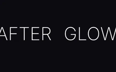
Good posters usually have one huge word and everything else small. The hard part is making that word huge enough. A common rule: push it as far as it goes, then take one step back. The Big Type rig is built on that rule.
How it works
Big Type fits your headline edge to edge using the shape of the actual letters in your font, not the invisible box around them, so it really touches the sides. Then it pushes it in one of six ways:
- Cut off an edge: blown up past the bottom, top, left or right of the frame, so part of the letters is cut off
- Stretched tall: each line stretched to fill a share of the height
- Stacked letters: one letter per row, each stretched to its cell
- Split by a gap: the word broken apart, with its ends running off the sides
- Up the side: running up or down the edge, partly off the frame
- Fit the width: each line filling the full width
The crop is capped so the word still reads. That cap is the "one step back".
How to use it
Open Rigs in the toolbar and add Big Type (under Type). Type your headline and pick a preset: Bleed, Tower, Stack, Split Word, Side Run or Fit. The dice roll new treatments and colours but keep your words.
Big Type is only for the headline. Keep dates, venue and lineup as ordinary text layers, small and on a grid, so they stay easy to edit. For texture, add grain or a duotone with the camera filters.
Ideas
- An event flyer in 9:16: the night's name stretched tall over a Split photo, details tiny underneath.
- A one-word Spotify Canvas, the word cut off the bottom edge.
- A launch title that runs up the side of a product shot.
Try it in Kubrick
Start free trial